Hi there! I am currently a UX designer at Code and Theory in New York City. Before that, I was a journalist and made a career switch through General Assembly's UX bootcamp.
I like designing interactions, sketching user flows, and dabbling in visual design and code. There are so many ways — big or small — for design to improve our lives, and I want to uncover those opportunities.
Feel free to reach out! I'm always willing to chat.
Be aware. Come out of my own head and see the world from different perspectives.
Make the words and pixels count. Don’t over-design or over-write.
Learn new things to tackle a problem. Read, experiment, talk to humans.
Ask for feedback and test ideas with users. I don’t always know the answer.
Friends of Fort Point Channel is a small nonprofit — their mission is to make the Fort Point neighborhood a great place to live, work, play. As a nonprofit, they are largely dependent on donations.
Our client asked us to redesign their donations page in order to see more traffic to the page and more donations.
A simple facelift of the donations page wasn’t going to solve what sounded like the root problem: the organization isn't seeing many online donations. We decided that the entire site needed a redesign, from its information architecture, to key UI elements, and to what users encounter before and after making a donation.
In a three-person team, I was the lead interaction designer, lead writer, and client point of contact.
Sketch, Photoshop, InDesign, Marvel
3 weeks
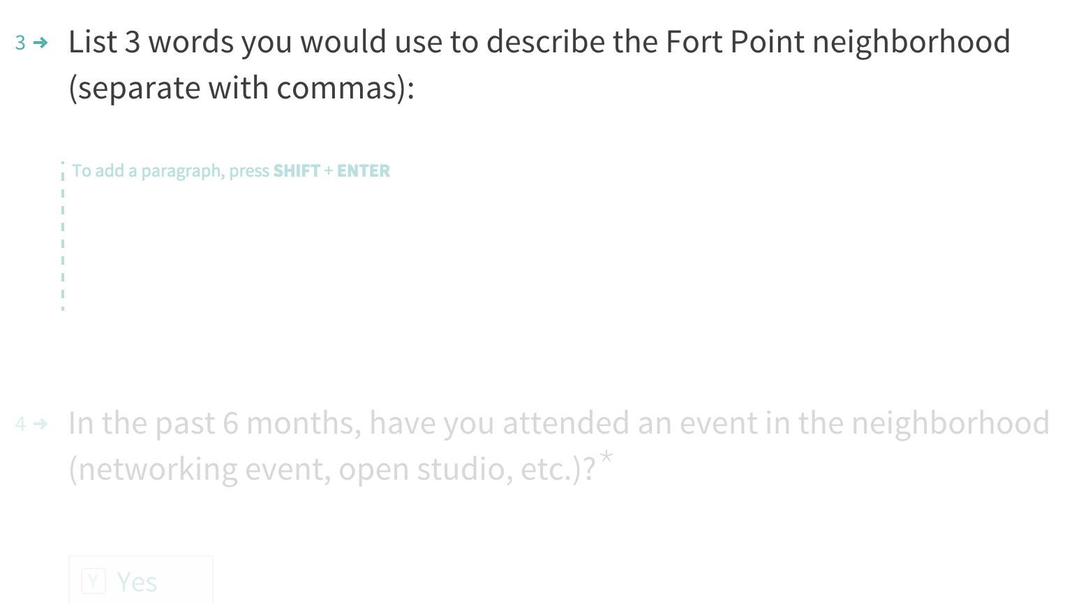
We conducted 7 phone interviews with local businesses. Key findings:
The survey was distributed through newsletters and social media. It received 87 responses. Key findings:
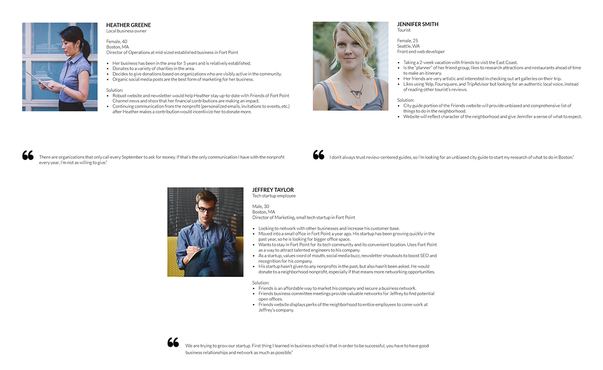
From our research, we created three personas to guide our user-centered design processes.
We conducted basic testing on our prototypes, by asking users to complete a series of tasks. Key findings:
Rethinking the information architecture for the site proved to be our biggest challenge. The current site architecture is cluttered and runs both wide and deep.
We did many rounds of card sorting and affinity mapping to create the site map.
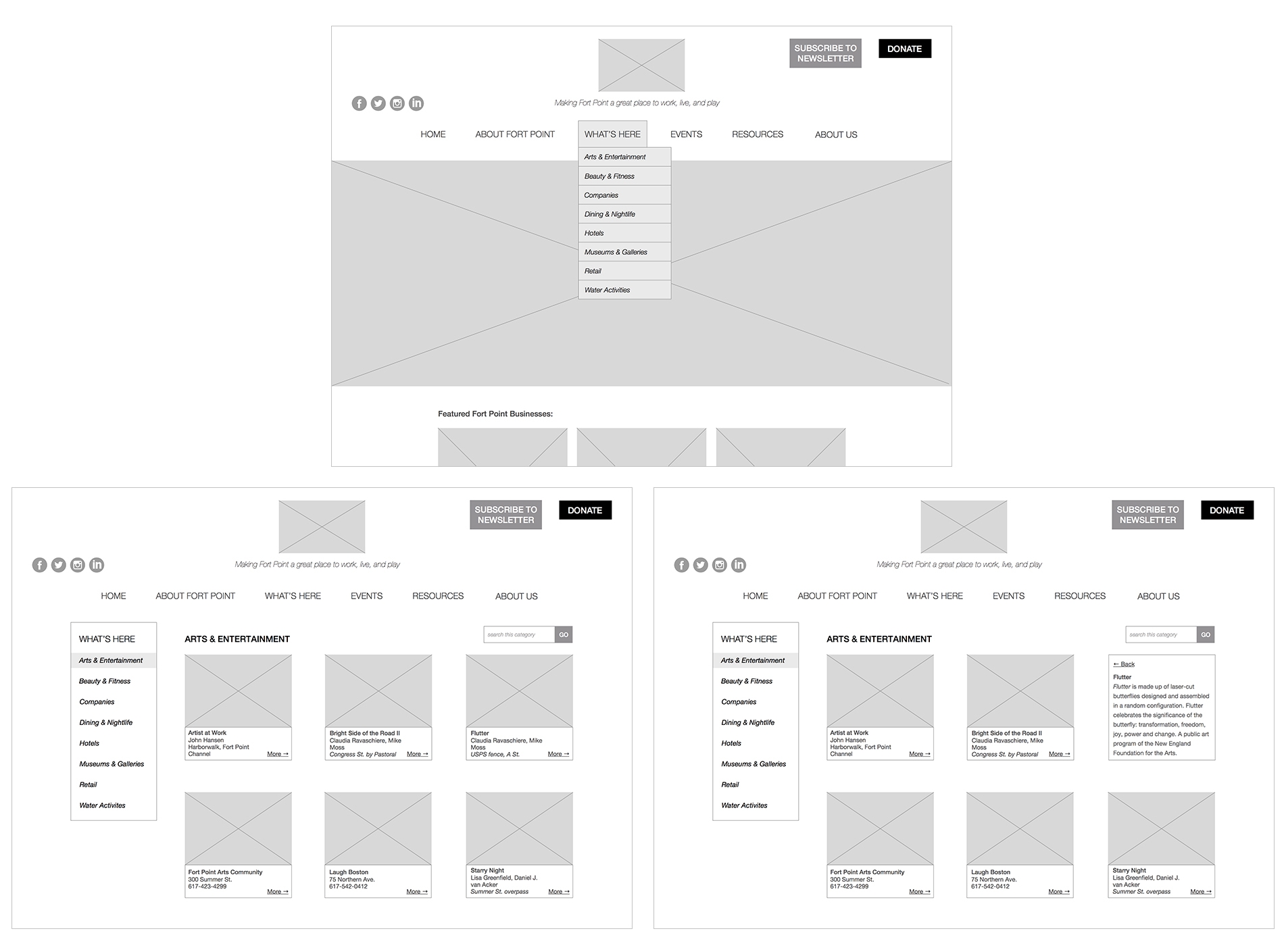
We propose the following site architecture, which reduces the number of top-level navigation items and organizes information intuitively.
In our proposed design, there is a clear and prominent button to donate, which is missing from the current site. We also created space on the homepage for Friends to feature local businesses (i.e. partners or biggest donors), which both the client and businesses told us they wanted.
The proposed donation flow is designed based on the PayPal Pro platform. Donation incentives are clearly displayed on the right and include a recommended option.
Overall, the site has a lot of useful content, but it's currently displayed in a way that is confusing and increases the user's cognitive load. In our proposed grid layout, we use cards and lists to layer the information strategically so that it doesn’t overwhelm the user; rather, it allows the user to see more information if he or she wants. The grid layout also scales to smaller devices nicely.
Virgin Atlantic has consistently been an industry leader. It pioneered award-winning first class suites, and it was the first to install screens on the back of every seat for in-flight entertainment. But competitor airlines have adopted these innovations and leveled the playing field.
Virgin Atlantic must regain its competitive advantage in the industry by leveraging user experience as its key brand differentiator.
As user experience begins to overtake price and product as the key brand differentiator, Virgin needs to once again raise the bar and create what no one else is creating. Virgin can improve passenger satisfaction during check-in and on board the flight by a) streamlining efficiency, b) offering personalization, and c) improving the health of passengers.
The visual design, style, and tone had to stay in line with Virgin’s existing cheeky and hip brand. The solutions also had to account for known constraints at airports or aboard the plane.
We designed 5 solutions that will improve the Virgin passenger experience in efficiency, health, and personalization. Some are incremental improvements to existing Virgin products and services, while others are new creations.
In a team of three, I was the lead writer, lead interaction designer for Red, and presentation designer.
Illustrator, Photoshop, InDesign, InVision
3 weeks
The four main competitors to Virgin Atlantic’s international market are British Airways, Cathay Pacific, American Airlines, and Lufthansa, according to Skytrax.
By sketching a user journey of the check-in process, we could identify bottlenecks and pain points (of which there were many).
One of the biggest things that stood out was that passengers often had to wait in line twice — once to use the self-service kiosk, and another time to speak with an agent at the counter. Why not cut some of that wait time out? With Wally, passengers can look up their flight, check their luggage, and change their seats while waiting in line. When they arrive at the counter, the agent will hand passengers their printed documents and collect their luggage.
Allowing passengers to check in while waiting in line to see an agent eliminates wait time by almost 50 percent. It also shortens the amount of time each passenger spends at the counter, because the majority of the check-in process is already completed on Wally.
Passengers can also order food and beverages on Wally for their flight.
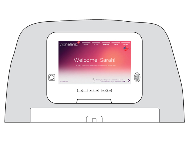
We added several new features on Red to provide a more personalized passenger experience and a healthier trip. At the left of the screen is an oximeter for passengers to measure their oxygen levels during the flight. At the right is a fingerprint sensor for passengers to log in to their accounts (account creation is optional).
Frequent travelers often order the same drinks or snacks on every trip. When passengers log in with their fingerprint ID, Red will remember all service orders and make it easier for travelers to order again on the next flight.
The tablet will help the in-flight crew keep track of passenger orders and requests. When a passenger makes an order on Wally or Red seatback, the information is sent to the In-Flight Team Tablet, and crew members can begin preparing the beverages.
Oxygen bars can reduce anxiety and fatigue, and they are also trendy and luxurious. No other airline currently offers recreational oxygen services, so this differentiates Virgin from the pack.
This is a simple addition with the potential for a large impact. Adding hand sanitizer, Airborne tablets, gum, and lip balm to Virgin's existing amenity kit will help passengers stay healthy.
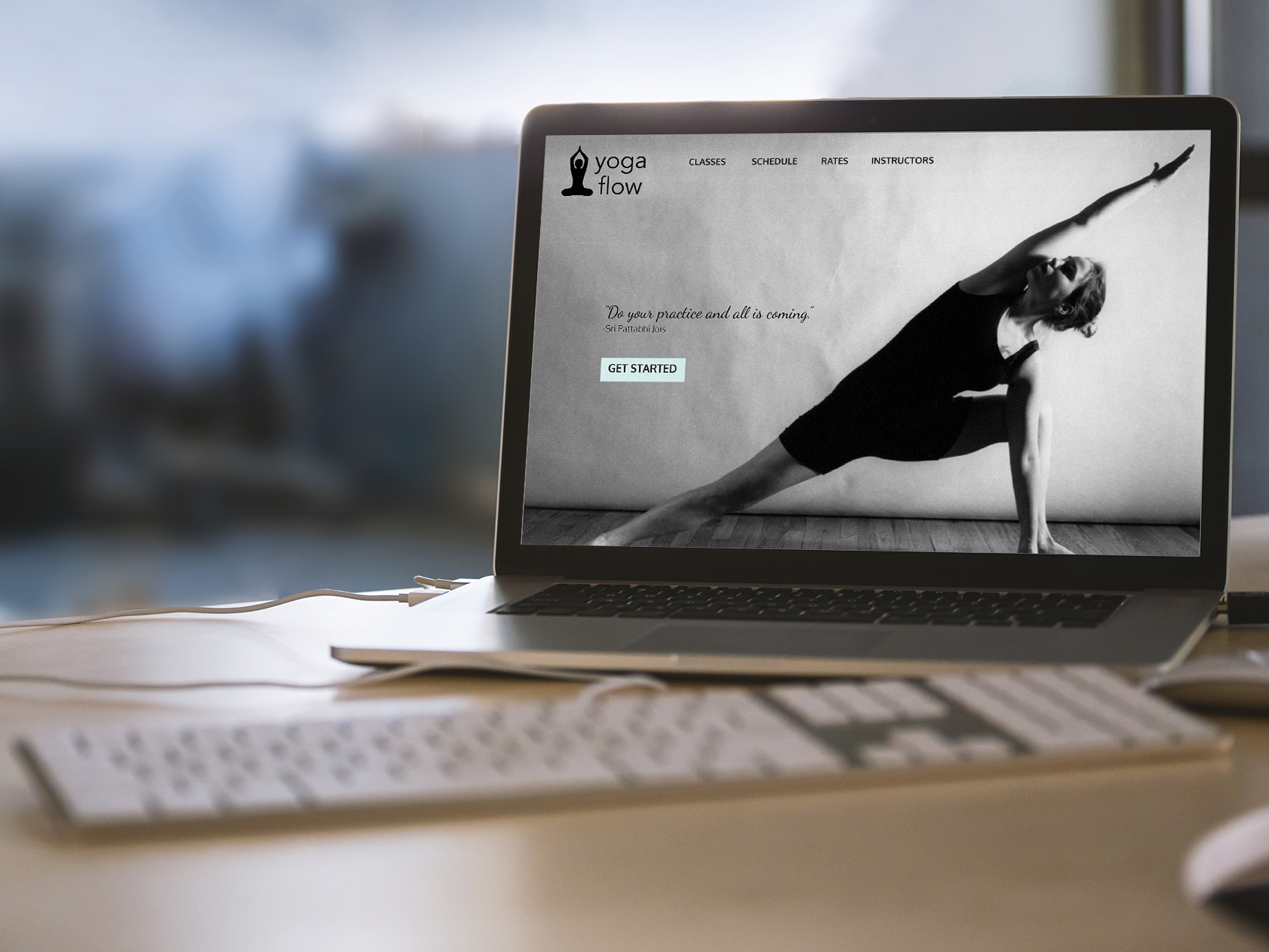
The majority of yoga studio websites suffer from poor user experience, outdated visual design, and lack of modern web design practices, like responsive design.
Yoga is becoming more and more popular across the country, so competition among studios can be intense. The user experience of a studio's website can be a key brand differentiator. It is important for a yoga site to:
YogaFlow (a fictional yoga studio) cannot compete with other yoga studios in Boston and other boutique fitness communities such as SoulCycle and CrossFit. Users report difficulty learning about membership options and signing up for classes on YogaFlow's current website.
Create an easy-to-use and informative site for users to register for, pay for, and learn about yoga classes. The site should evoke a clear brand identity with strategic use of color, typography, and spatial relationships.
This was an individual project. I was the lead project manager, researcher, project manager, information architect, interaction designer, and visual designer.
Illustrator, InDesign, Marvel
2 weeks
I conducted a usability test on Kevin, a local designer He has attended a couple of yoga classes in his life. Kevin was given 10 tasks to complete on the clickable prototype. Key findings:
One of the most challenging aspects of the project was determining user flow around booking classes and buying memberships. I ultimately decided to include a guest checkout option for users who only want to buy one class. Users can also buy a monthly membership or 10-class-pass
After conducting usability testing and incorporating feedback from classmates, I went through many iterations of my wireframes.
Homepage: In version 1, the class schedule was nested under "Classes" in the top-level navigation. But the schedule is one of the site's most important pages, so it deserves a place in the top-level navigation.
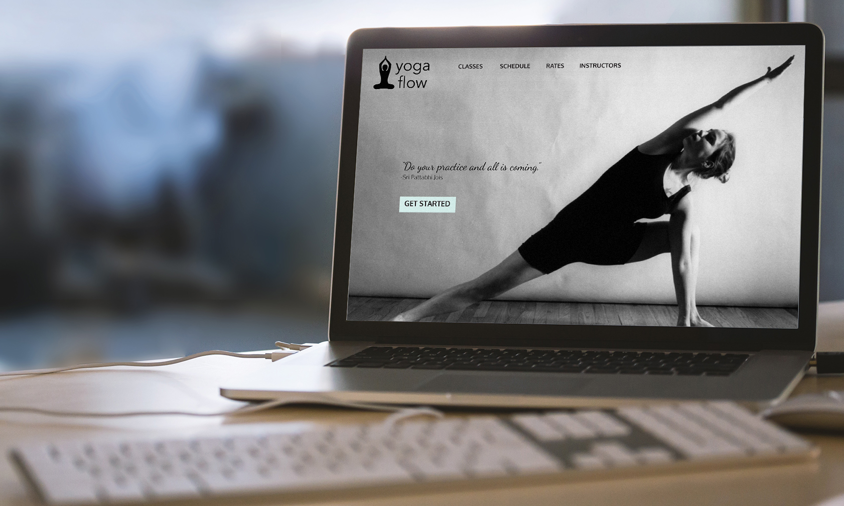
In the newer version, there is a more visible affordance for users to sign up or get started. I removed the log in forms from the masthead to decrease clutter.
Schedule: Version 1 looks cluttered and testing showed that it increased cognitive load for the user. The newer version presents the information in a more visually-pleasing format. I changed the filters for class, instructor, and level into drop-down refiners.
Member Dashboard: In version 1, there were four separate pages for classes, membership, payment, and preferences. To prevent excess clicking, I combined them into one page with a "card" layout.
Checkout: In the newer version of the checkout flow, I removed the top-level navigation to optimize conversions.
I picked a calming color palette that evokes a soothing and natural mood. The typography is a clean and easy-to-read sans-serif.
This project was created during a 48-hour sprint at General Assembly (our first project!). The objective was to interview a classmate, identify a problem, then present the solution with a few key screens and a clickable prototype.
My classmate Rachel is new to the Boston area. She likes attending concerts and meeting up with friends in the city. She has a car but is very intimidated by parking. She doesn't know what parking spots are available at any given time and if they are safe or affordable.
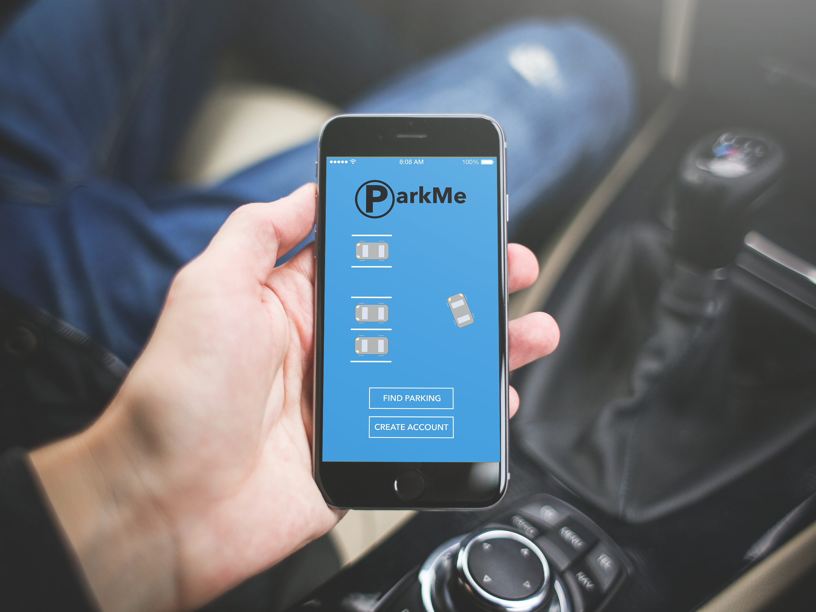
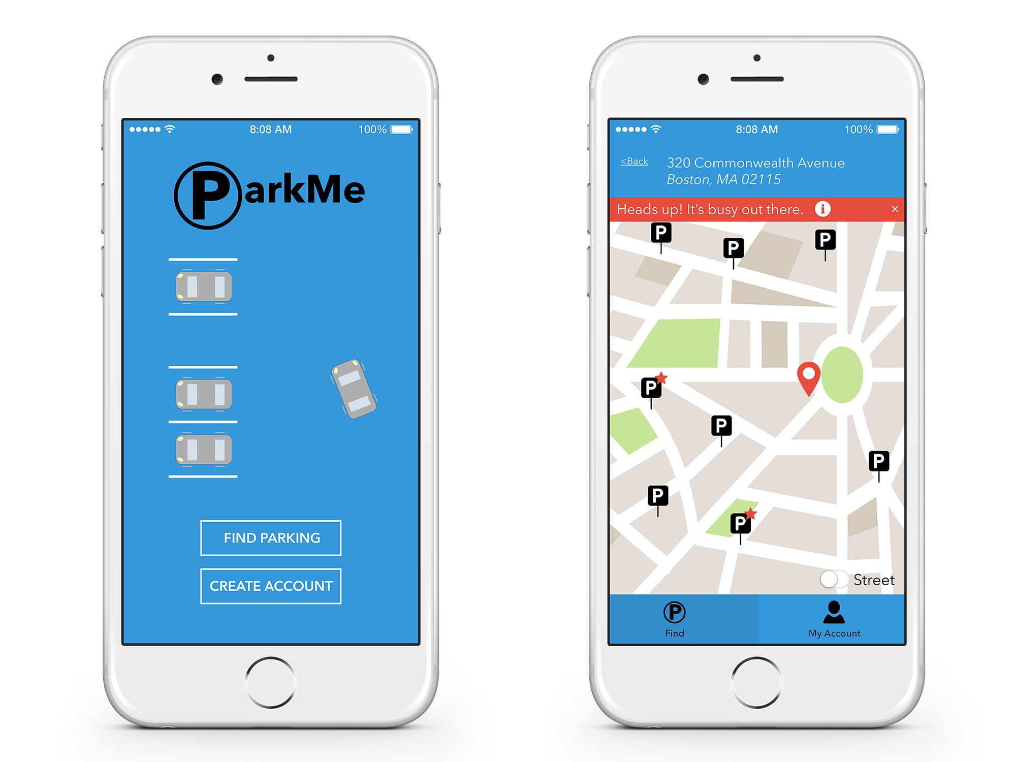
ParkMe is designed to eliminate the stress and frustration associated with finding parking. The app recommends parking for the user based on availability, safety, price, and distance.
This was an individual project. I was the lead project manager, user interviewer, and designer.
Balsamiq, Illustrator, Marvel
I conducted an interview with Rachel, who explained her problem. "It's hard to drive to an area I've never been to AND pay attention to road signs AND find parking ... If I do get to a particular lot and there are no available spots, I get very anxious." — Rachel
I showed Rachel some of the parking apps already out there, and she said they don't help her find the best option.
A few must-haves for the solution:
I decided to allow users to create an account, because the app could start tracking user activities and provide better recommendations. Everyone has slightly different priorities when it comes to parking (whereas Rachel would almost always park in a garage or lot for safety and reliability, others look for street parking first to save money). With ParkMe, users can create an account and specify their parking priorities.
Then, based on the user's priorities, destination, and how long he or she needs to park, the app provides personalized recommendations (denoted with a star).
Lorem ipsum dolor sit amet consectetur.
Lorem ipsum dolor sit amet, consectetuer adipiscing elit, sed diam nonummy nibh euismod tincidunt ut laoreet dolore magna aliquam erat volutpat. Ut wisi enim ad minim veniam, quis nostrud exerci tation ullamcorper suscipit lobortis nisl ut aliquip ex ea commodo consequat. Duis autem vel eum iriure dolor in hendrerit in vulputate velit esse molestie consequat, vel illum dolore eu feugiat nulla facilisis at vero eros et accumsan et iusto odio dignissim qui blandit praesent luptatum zzril delenit augue duis dolore te feugait nulla facilisi.